
In the world of graphic design, color is a powerful tool that can make or break a design. It has the ability to evoke emotions, convey messages, and capture attention. However, using color effectively requires a deep understanding of color theory. In this article, we’ll delve into the fundamentals of color theory and its applications in modern graphic design.
The Color Wheel: A Designer’s Best Friend
The color wheel is a circular representation of colors, showing how they relate to each other. It’s divided into primary colors (red, yellow, blue), secondary colors (orange, green, violet), and tertiary colors (colors created by mixing primary and secondary colors). Understanding the color wheel is essential for creating harmonious color combinations.

Color Harmony: The Key to Visual Appeal
Color harmony refers to the way colors work together to create a visually appealing effect. There are several principles of color harmony, including:
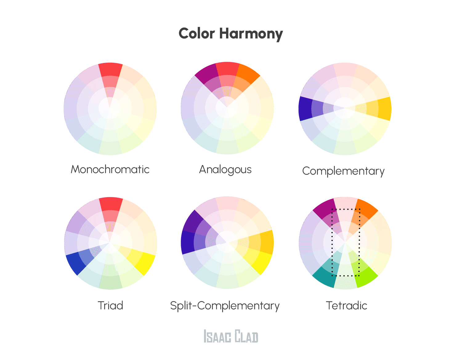
- Monochromatic: using different shades of the same color
- Complementary: pairing colors opposite each other on the color wheel
- Analogous: using colors next to each other on the color wheel
- Triadic: using three colors equally spaced from each other on the color wheel
- Split-Complementary Color Scheme: pair a color with the two colors on either side of its complementary color.
- Tetradic Color Scheme: uses two pairs of complementary colors.
Color Properties: Hue, Saturation, and Value
Colors have different properties, including:
- Hue: the actual color (e.g., red, blue, etc.)
- Saturation: the intensity or brightness of a color
- Value: the lightness or darkness of a color
Color and Emotions: The Psychology of Color
Colors can evoke different emotions and moods, such as:
- Red: energy, passion, excitement
- Blue: calmness, trust, reliability
- Green: nature, growth, harmony
Applying Color Theory in Modern Graphic Design
In modern graphic design, color theory is used to:
- Create Visual Hierarchy: Use color to draw attention and guide the viewer’s eye
- Convey Meaning: Use color to communicate messages and emotions
- Establish Brand Identity: Use color to create a consistent visual brand
- Enhance User Experience: Use color to create an engaging and interactive design
Best Practices for Using Color in Graphic Design
- Limit Your Palette: Use a maximum of 3-4 colors to avoid visual overload
- Use Contrast: Use contrasting colors to create visual interest
- Consider Context: Consider the cultural and personal associations of colors
- Test and Iterate: Test your design and make adjustments as needed
Why it matters
Color theory is a fundamental aspect of graphic design, and understanding its principles can elevate your designs from good to great. By applying color theory principles, you can create designs that are visually appealing, emotionally engaging, and effective in communicating your message. Remember, color is a powerful tool, and with great power comes great responsibility. Use color wisely, and your designs will thank you.